the woman in black
|
the font of the titles 'Daniel Radcliffe' and 'The Woman in Black' suggests that the film is for a mature audience as it looks old fashioned written which shows that the film is going to be set in the past. Daniel Radcliffe's name is mentioned as its familiarized and people would want to see the film if their fans of the actor. The titles are in black and white which hints that the film isn't going to happy/fun as of the lack of colour. The window is seen from the inside which suggests someone is enclosed in the 'haunted house'. The weather is bleek which is a pathetic fallacy, projecting the mood and genre of the film. the shadows on the window suggest the film is going to have mystery and suspense which fits into the category of the sub-genre being paranormal.
|
|
sinister 2
|
The titles are directed towards the audience using personal language such as 'you', which would engage them. They make the audience fear the being of Bagul as much as the family are on screen even though he is seen to be a fictional character. it states 'Nothing can save you' presenting that there is no escape from his spirit. The font is 'Sinister' gives the appearance that each letter is bleeding. Furthermore, the background could represent stone giving the impression they are grace stones adding to the haunting feel. The trailer contains a Facebook page at the end, showing its aiming it's audience over different media platforms.
pictures; https://www.slideshare.net/AlysLeMoignan/sinister-film-trailer-analysis-40176331 |
|
insidious: chapter 2
|
The title that follows in the trailer states 'From the makers of Saw and Paranormal Activity' the Saw movie containing 7 movies in its series and Paranormal Activity containing 4. This engages the audience as they link good horror films they may have priory seen to this film which may make the audience want to see it, through the association of the others; when this screen appears. The colours represent a horror genre, altogether with the haunting music that accompanies it.
The text we firstly view is 'it began two years ago' which indicates that this is a sequel of a previous film and that the story hasn't yet finished. At the end the name of the trailer appears on the screen, accompanied by 'TIpToe through the Tulips song'. The music the alters to another soundtrack associated with the film and more text is seen which is in the same style as the title with the same colours, fonts and background except the text presents what date the film is being officially released to the cinemas. The initiates that the trailer has finished. |
|
in conclusion
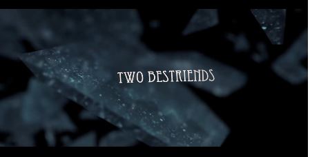
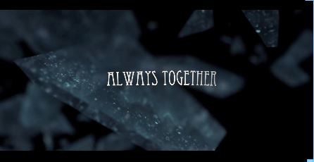
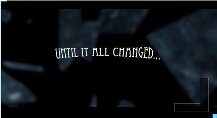
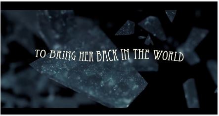
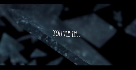
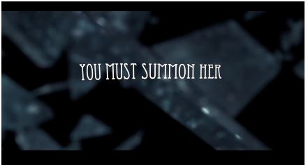
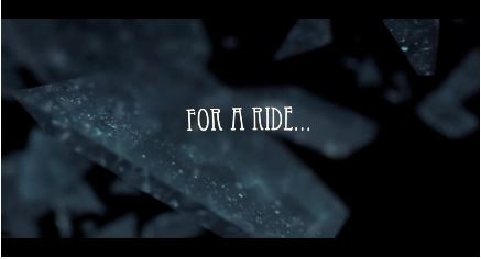
In our trailer we were more inspired by the 'scream' style of text, it's colour of text and the smokey effect of the title and background. Moreover, the font of the titles in the 'Annabelle' is a similar font named 'Eccentric'; we found this font professional but at the same time eerie and not too in your face. Like the 'Woman In Black 2' trailer. With that, the effects added on to our titles was several in order to capture our audience and create an uneasy environment. So the effects added named 'underwater', 'Earthquake' and 'Handheld'. The purpose for these particular effects is because we wanted our audience to feel that when these tiles appear they feel somewhat relaxed, but when reading the title paints the uneasy feeling. Also, once these tiles end, the clips of the trailer appear and gets more sinister and suspenseful as you go. Furthermore, we used a mirror shatter effect in the background is because this is a key to understand more about what is causing the mayhem; which would be Rebecca (Jozi), summoning Melinda (Zoe) through the mirror; which we thought was effective and creative. The key titles 'UNTILL IT ALL CHANGED' 'YOU MUST SUMMON HER' 'YOU'RE IN...' 'FOR A RIDE...'; we thought would be the important bits for the audience to acknowledge that after the fatal accident of the car accident, Rebecca's (Jozi's) life had changed, and with her summoning Melinda (Zoe) Jozi and the audience will jump into a daunting rollercoaster and Zoe's hauntings.
|
|
|
|
|
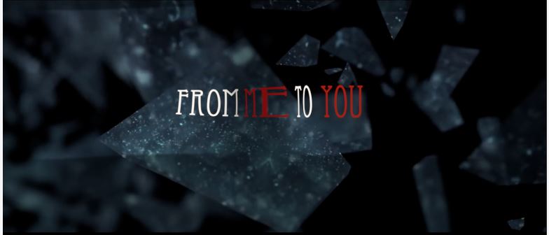
The font we chose thought stood out, and sets an environment of suspense and mystery. We've chosen the shattering glass with a black background as this relates to the trailer of a mirror being broken; however the shattering effect we thought would make the film dramatic and engaging to look at. The title of 'FROM' and 'TO' is white as it makes the title stand out from the background, but the more captivating words would be 'ME' and 'YOU'. The reason for why these words are coloured red is because the representation is death, danger and blood which relates to the film as Zoe is going to die, and Jozi is in danger as she tries and summon Zoe.
Why we chose the title 'From Me to You'. This is because we believed that this would drive our audiences idea of what they think our trailer would be about; as we won't be giving too much away during the trailer. With this simple title, the audience would have a chance to let their creativity of the film be drawn in their train of thought; with the eager question of 'Who is me' 'Who is you', 'Will something be given to someone' and such. With these thoughts flying around, this would make them suspicious but at the same time unsettled with what the trailer is about. In a standard horror genre, males would be stereotyped as characters who kill, stronger and its more expected for the male to cause more harm than female, even as spirits. Meaning most of the viewers would think a male character would be the killer; however we've contradicted this fixed expectance. As one of the characters is female, who kills her female friend because she attempts to summon her but now her friend is haunting her. So, we came up with the title 'From Me to You' because the 'Me' is the friend who's died and the 'You' is the friend that tried to summon her, but ends up being haunted.
Why we chose the title 'From Me to You'. This is because we believed that this would drive our audiences idea of what they think our trailer would be about; as we won't be giving too much away during the trailer. With this simple title, the audience would have a chance to let their creativity of the film be drawn in their train of thought; with the eager question of 'Who is me' 'Who is you', 'Will something be given to someone' and such. With these thoughts flying around, this would make them suspicious but at the same time unsettled with what the trailer is about. In a standard horror genre, males would be stereotyped as characters who kill, stronger and its more expected for the male to cause more harm than female, even as spirits. Meaning most of the viewers would think a male character would be the killer; however we've contradicted this fixed expectance. As one of the characters is female, who kills her female friend because she attempts to summon her but now her friend is haunting her. So, we came up with the title 'From Me to You' because the 'Me' is the friend who's died and the 'You' is the friend that tried to summon her, but ends up being haunted.
MR
