When studying different genres, the impact that the director wants to create through the use of a trailer will differ. In this case for a horror trailer the atmosphere that is being created must be mysterious and suspenseful in order to scare the viewers. We have researched 3 different types horror titles to investigate the colours, fonts and styles that make the viewers want to see the trailer.
annabelle
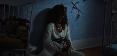
The font style is Serif Font, this font produces a solemn mood connoting that the movie will not be light-hearted. The motion of the text involves the wall with the text disguising the pattern of the wallpaper, which is a sinister feeling created. This connotes to the audience that this film is about 'scary' activities in the house. The name is coming out of the wall, as in the beginning of the trailer the woman died near a wall and the letter 'A' was on it.
|
|
Furthermore, the motion if title there is the source of light that moves from top left of the screen to the right. This motion produces a shadow under the title of the film, this shadow makes shapes of coffins when looked at closely which is symbol of death. Which also suggests to the audience that this film is distasteful.
Other titles shown such as the producer's name and other films that he directed (The Conjuring) is seen during the trailer. These tell the audience about the genre, however also what they can aspect to see in the film.
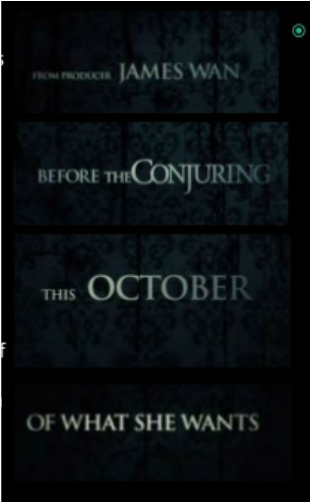
By showing the name of the earlier film it shows that this is the prequel of 'The Conjuring'. This is an effective way of captivating the audience that have enjoyed the movie and now can see this one (Annabelle). All through the trailer, the audience is being drawn to find out more about Annabelle by the title "THIS OCTOBER FIND OUT WHAT SHE WANTS", this title is in the same font as the other titles during the trailer, which we found effective.
scream 4
The title of the film lessens (big to small) as the film goes on. The text is in bold placed in a black background, this makes the title stand out however also shows the purity of the colour white being captured by the black background connoting bad. This colour theme is generic in horror films.
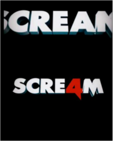
The letter 'A' is replaced with a 4 in a knife symbol from the Scream title. Meaning that the word 'Scream' has a brilliant significance and the film will include a lot of blaring. Furthermore. the colours used are important. The letter 'A' is in red and it creates a negative atmosphere as red connotes danger. The rest of the letters are in white and we typically connect white with ghosts.
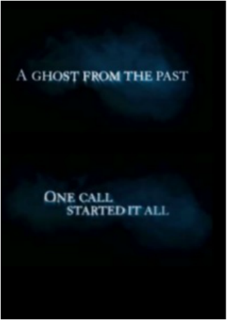
The titles in the trailer is placed on a black background covered in smoke, which creates a ghostly theme. The words 'A GHOST FROM THE PAST' connotes that a person from the past is going to return. This can mean a victim that has lasted in other films or the villain himself. The text is in capitals and looks similar to the font 'Ariel' or 'Calibri'. There text is serious which proposes that the genre as horror. The words 'ONE CALL STARTED IT ALL' refers back to the earlier 'Scream' films and how the villain started murdering his victims.
woman in black 2
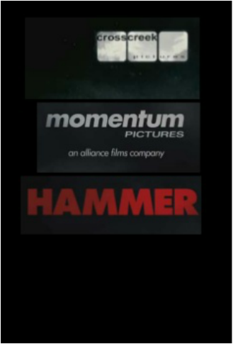
The trailer declares that the combination of Cross Creek Pictures, Momentum Pictures and HAMMER made this film. Cross Creek has previously produced 'Black Swan', 'Pride and Prejudice and Zombies'.
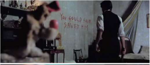
Blood is used in this shot which refers to the horror genre. However, as a victim is not seen the audience are left to wonder who the blood belongs to. The words 'You could have saved him' also attain mystery as to who 'he' is and why the message is written on the wall. The darkness of the shot builds a misgiving atmosphere and the fact that in the left frame of the shot the moving monkey toy is spotted refers to the ides that the character is being watched, gaining more suspicion.
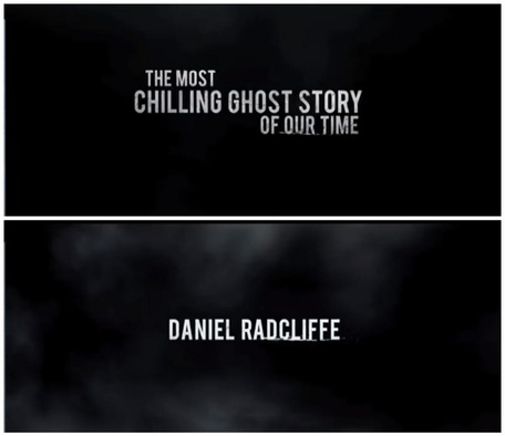
During the trailer a white text over a black background appears reading "THE MOST CHILLING GHOST STORY OF OUR TIME". These few words are very simplistic but very gripping as it captures the audience's attention. This is because, at this point, the audience have already viewed a minute worth of the trailer, and are entertained by it as it engages them. Therefore, by applying this text in at that moment the audience won't forget the text and will fortify how brilliant the film is, also encouraging them to watch it. The colour scheme of the titles were simple yet suspenseful. The white typically connotes death and ghost which link with the film's storyline. They made us believe that this statement is true, meaning the audience will believe this piece of text too.
Furthermore, they have applied the main actors name 'Daniel Radcliffe', which is in a white text on top of the black background; with a little grey smoke effect that crosses the screen. Creating a ghostly effect. The main actor can also attract many of his fans. Moreover, by using 'Daniel Radcliffe' a famous actor, it can boost promotion of the film.
Furthermore, they have applied the main actors name 'Daniel Radcliffe', which is in a white text on top of the black background; with a little grey smoke effect that crosses the screen. Creating a ghostly effect. The main actor can also attract many of his fans. Moreover, by using 'Daniel Radcliffe' a famous actor, it can boost promotion of the film.
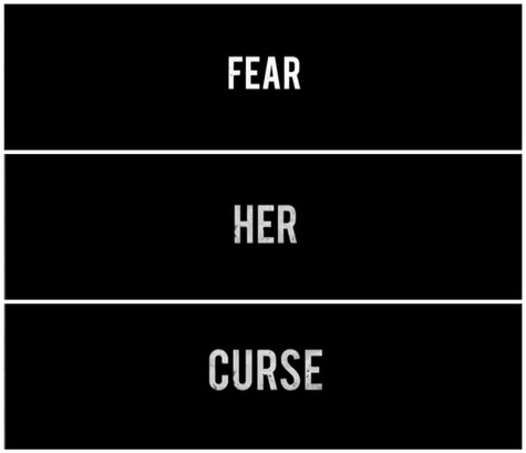
Near the ending of the trailer, these three separate words 'Fear Her Curse' are displayed on the screen in the space of 5 seconds. Each of these tiles are shown one after the other in between clips. This creates a quick effect, suggesting that the film is full of action, also appealing the audience. The text is continued with the colour scheme being white as the title on a black background.
In conclusion
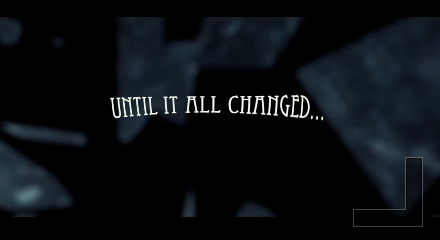
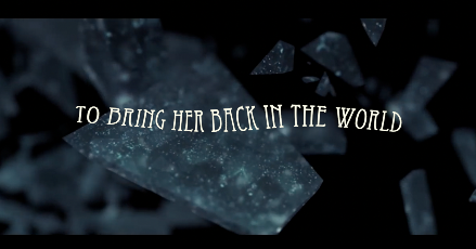
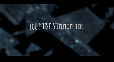
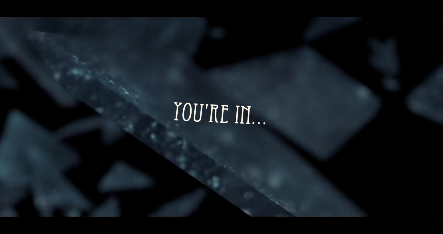
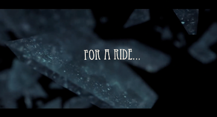
In our trailer we were more inspired by the 'scream' style of text, it's colour of text and the smokey effect of the title and background. Moreover, the font of the titles in the 'Annabelle' is a similar font named 'Eccentric'; we found this font professional but at the same time eerie and not too in your face. Like the 'Woman In Black 2' trailer. With that, the effects added on to our titles was several in order to capture our audience and create an uneasy environment. So the effects added named 'underwater', 'Earthquake' and 'Handheld'. The purpose for these particular effects is because we wanted our audience to feel that when these tiles appear they feel somewhat relaxed, but when reading the title paints the uneasy feeling. Also, once these tiles end, the clips of the trailer appear and gets more sinister and suspenseful as you go. Furthermore, we used a mirror shatter effect in the background is because this is a key to understand more about what is causing the mayhem; which would be Rebecca (Jozi), summoning Melinda (Zoe) through the mirror; which we thought was effective and creative. The key titles 'UNTILL IT ALL CHANGED' 'YOU MUST SUMMON HER' 'YOU'RE IN...' 'FOR A RIDE...'; we thought would be the important bits for the audience to acknowledge that after the fatal accident of the car accident, Rebecca's (Jozi's) life had changed, and with her summoning Melinda (Zoe) Jozi and the audience will jump into a daunting rollercoaster and Zoe's hauntings.
|
KEY
|
|
KEY
|
|
KEY
|
|
|
KEY
|
MR
