Production Company Research
|
|
|
Production Company Research provides the physical basis for works in the realms of the film production.
Production companies produce a signature logo with a memorable and well-known motion picture. The moving picture and logo is also known as an Opening Title Sequence (OTS), therefore it is important that our OTS has a signature logo and contain a creative motion picture like similar to the following successful production companies i.e. Twisted pictures, Ghost House, Lionsgate, Blumhouse and Hammer Productions.
Several techniques will have to be applied to keep the viewers engaged and entertained which are camera movements, but shots/angles, sound effects/soundtrack, colours and lighting. Also for our audience observe what our trailer would be about. Also, the sub-genre of our trailer should fit the OTS e.g. The OTS could include smoke effect (signifies ghostly effect) whilst spelling out the title; this fits the sub-genre of paranormal. The 6 successful production companies we will be researching is listed below:
Several techniques will have to be applied to keep the viewers engaged and entertained which are camera movements, but shots/angles, sound effects/soundtrack, colours and lighting. Also for our audience observe what our trailer would be about. Also, the sub-genre of our trailer should fit the OTS e.g. The OTS could include smoke effect (signifies ghostly effect) whilst spelling out the title; this fits the sub-genre of paranormal. The 6 successful production companies we will be researching is listed below:
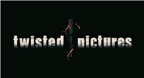
Twisted pictures productions |
Twisted Picture Productions is an American independent production company, mostly creating films of the horror genre. The production was discovered in 2004 by Evolution Entertainment's Mark Burg, Oren Koules and Gregg Hoffman. Their recognised for making the Saw film series.
The most famous and only early horror movies produced in this company includes Saw and Texas Chainsaw. In the beginning of their OTS, brown coloured barb wire from behind the title appear, and quickly wrap the title. Suddenly a dagger from above keep the barb wire together, then it twists the wire around the title. After this, flashes (lightning) release the wire around the title, then remains a slowly spinning dagger with some wire wrapped. We found this opening effective, because they way the animation of a dagger 'twisting' the wire from the title was creative. Then the flashes which suggests 'pictures' we also found imaginative. |
|
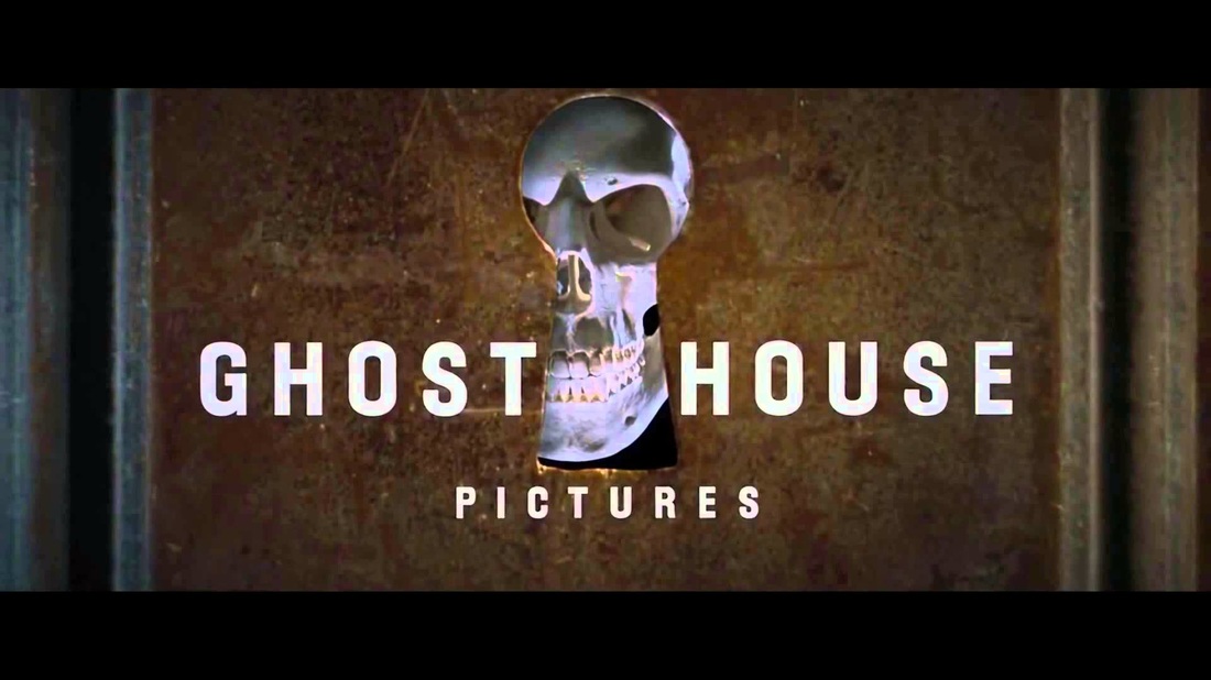
One of the many popular production companies is Ghost House Productions. This is an American horror movie production was found in 2002 by Robert Tapert and Sam Raimi.
The most popular old films produced by this company are The Grudge, Drag me to Hell, The Children, The Messengers and more. However, their recent release Ghost House has produced is (2012)The Possession, (2013)Evil Dead, (2015)Poltergeist and currently (2016) Don't Breathe. The opening title starts off with a old brown door with a black handle closed shut. Then the camera uses the camera movement Dolly to move towards the keyhole which a skeleton head appears along with the logo of the production. This we found effective as the moving towards the keyhole built tension to reveal a skeleton. The colouring used was white for the logo and brown for the background. White represents purity, innocence and safety. However this is a horror film production, so this contradiction will frighten viewers. |
Ghost House productions |
LIONSGATE productions |
This production is also an American entertainment company, legally incorporated in Canada. Lionsgate was discovered July 3, 1997 in Vancouver, British Colombia, also is nowadays headquartered in Santa Monica, California. The division of this company includes Lionsgate Television and Lionsgate Interactive. It owns several subsidiaries such as (American film production) Summit Entertainment and Debmar-Mercury.
The camera techniques used in the start is tilt, pan, pedestal (ped) and dolly. the camera pans across the clockwork in a tilt motion; then peds out of the clockwork which operates a door; and dolly is used to move backward through the keyhole. Once the camera is outside the keyhole, the clockwork operates the door and opens to reveal the companies title 'Lionsgate'. The door has a sign of a lion, which we found effective, innovative and clever. The reason we found this effective is because, the company name is called Lionsgate and their is a lion imprinted on the gate. This would be effective, as the transition from a dark clockwork with the colours of gold and black signifying mystery and compassion. To a heavenly place of clouds we found creative and we thought engaging our audience. |
|
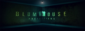
Blumhouse Production too is an American film and television production company; discovered by Jason Blum in 2000. The early famous movies this company has produced are Sinister, Oculus, Creep, The Purge:Anarchy and more. However the most recent well-known movies is The Visit, Unfriended, Sinister 2, The Lazarus Effect etc.
The opening title sequence uses the camera movement of tilt. The camera tilts down to a flying objects (chair and book flipping pages). Suddenly the camera stops to a girl in white dress turning her head to the camera in a medium-shot. Then the camera tilts down to a cracking ceiling, then tilts up to the production company logo 'Blumhouse'. The sound effects in the opening is a heart-beating, deep, breathing etc. This intro effective especially the sound effect, because the camera movements were continuous, therefore our audience would have a continuous engagement to our OTS. The filter and main colour of this OTS is blue, this colour signifies confidence, intelligence and trustworthy. Intelligence fits this OTS because the way the camera focuses on what's around the room with the added sound effects keeps the viewers watching and entertained; which is what makes Blumhouse Production successful. |
Blumhouse production |
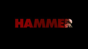
hammer productions |
Hammer Films Production is a British film production company based in London. Discovered in 1934, the company is recognised for their series of Gothic horror produced from the mid 1950's until 1970's. Hammer too made science fiction, thrillers, film noir and comedies. As years past television series were too produced.
The most popular horror movies this company produced is (1958)Dracula, The (1957)Curse of Frankenstein, (1970)The Vampire Lovers, (1961)The curse of Werewolf and more. However their latest and well-known movies produced is (2012)The Woman in Black The opening title sequence of this production starts with a fade in of two men sculpting the title from stone "A Hammer Production". The colouring of this sequence is in black and white. We found the animation and the colouring effective, as the two men hammering; hence the name "Hammer", we found innovative. The coloring made the opening look interesting, as white represents purity, goodness and innocence (positive connotation). However black represents fear, mystery and also power (negative connotation). |
no pulse productions
conclusion
After looking at several famous distribution company we decided to keep our logo simple and not too complicated we also wanted it to be relevant towards our name 'no pulse'. Our logo shows a ECG monitoring a heart we have chosen to use this because we are called No Pulse the ECG machine then flat lined showing there is no longer a Pulse.
We used the sound of the ECG monitor, so we immediately grab our target audience's attention. Also the monitor, we found effective as this suited our title 'No Pulse'.
The colour black indicates mystery, but also this colour allows our title to be highlighted. We have chosen the colour red because that is the colour of blood and the heart the earthquake effect was applied because it gave the effect of a horror and being uncertain of what is happening and what you are actually seeing.
The black coloured background that inspired us to create our Opening Title is Twisted and Hammer Productions. We also didn't use a camera movement like Twisted Productions, as we again wanted to create a simple sequence.
The title we've applied is in a slim font, which BlumeHouse had inspired us to use; we liked the slim font as we thought this would make the sequence look more elegant and professional. The reason why we say this is because, as the ECG monitor is moving with a thick font it would look messy and amateurish.
MR
