|
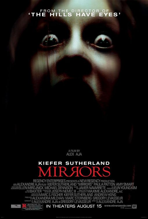
--------'FROM THE DIRECTOR OF' attracts fans of the movie to watch the movie.
---------The expression of her face (screaming) suggests that she is terrified and being tortured ----------Seems to have blood smearing across her face. ----------Black backgrounds indicates a negative connotation as it represents danger, death and also creates a vibe of mystery and wonder. Popular director of other films which will entice fans from his other films. Backwards R in a mirror emphasizes the fact the film is about mirrors. The reason for why i chose this poster 'Mirrors'. Is because the main attraction is half of the face of a screaming woman; and in my film Melinda (Zoe) would be the one haunting Rebecca (Jozi) after Jozi summons Zoe. Then you see half of the mouth like the mouth was separated which is what occurs in the film and the face seems to be coming out from the darkness behind her. The woman in the poster stands out as her eyes are widening in fear which indicates that she is being scourged in some way. Moreover there's a tint of red smeared across her face which has a negative connotation of blood and violence. the title is another tint of red this poster contains. The title itself lightens that the film is about mirrors as the second 'R' is reflected back from the normal 'R'. At the top of the poster is states 'From the director of' and 'The hills have eyes' which can attract fans from the famous movie 'The hills have eyes' attracts fans and encourages audiences who've never seen and or familiar to see the movie. |
|
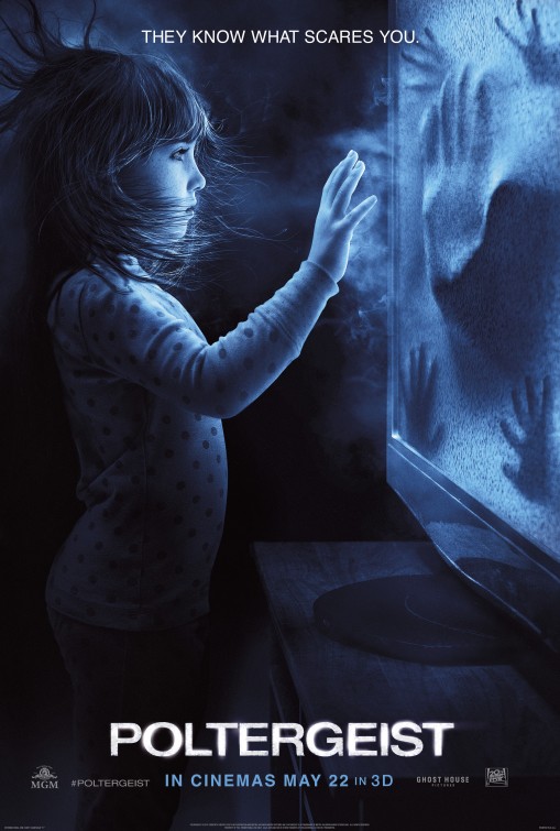
The film and the movie poster is one of the most well established film. The main colouring of this poster contradicts its stereotype, as blue gives a sense of relaxation (sea, sky, water); however since this is a paranormal film there will be emotions of fear and tension. Which engages the audience. The 'fuzz' colour on the screen is white, which signifies protection, love and innocence. Furthermore, the girl in the poster has her hands on the screen which tells the audience that she is possessed by the screen and she feels that she is 'protected' and 'loved' by the screen.
This poster gives us a hint that the girl would be, audience perspective, would be obsessed and controlled by the screen which contains a whole other world inside. The title of the poster/film 'Poltergeist' we found effective as the lighting behind the title illuminates and acts like the TV, also draws the attention from the audience. The font of the title is thick, however looks profession which we found interesting. Moreover, the statement 'It knows what scares you' is capturing and effective. The reason why is because not only does this statement make the audience curious to see the film, but it also makes them feel anxious to see what the film is about. Not only that but the title of the poster/film 'Poltergeist' means a ghost or other supernatural being supposedly responsible for physical disturbances such as making loud noises and throwing objects about. Which gives a link to what the film is about, as would immediately pull the audience's attention. |
|
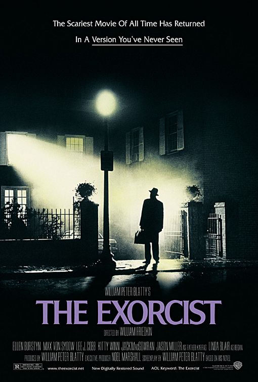
The exorcist is another well-known film and movie poster. The main colouring of this poster would be a combination of black and white. The colour black signifies evil, mystery and interestingly power. We found power interesting with the signification of black, because the little 12-year-old girl (Regan) was possessed by a 'powerful' force being a summoned demand, and the 'Exorcist' had to banish this force from Regan home and body. However, the white represents purity, innocence and safety. The colour white we thought fits with the title 'The Exorcist' because Exorcists responsibility is to not only remove demons from the possessed person, but to ensure that the possessed child (Regan) feels 'safe' and secured around the exorcist.
The man standing outside tells the audience that the man would be the exorcist, and make them curious as to who is going to be possessed. The light beaming in front of him, also tells the audience the importance of the man standing outside. Which is another reason why the audience would think the man is the exorcist. The font of the title is bold and is in the colour white. The font we thought is what got the audience's attention because it is clear and professional, and also it made the poster look more mysterious. |
|
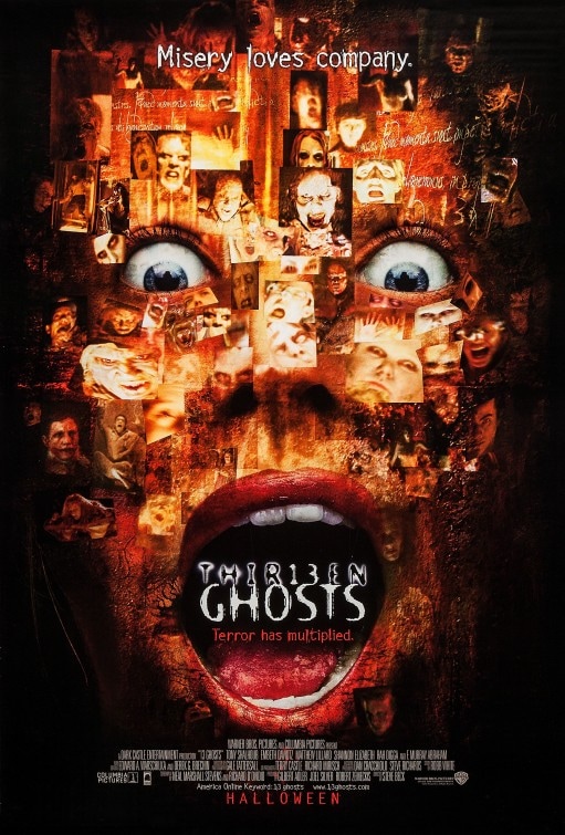
Thirteen Ghosts is one of the most eye-catching and gripping movie posters. The effective use of a woman's face covered with screaming faces we thought was fascinating and chilling. The black background helped make this poster look simple, and it also is good because it brings out the titles and face more. A close up shot of this face creates an atmosphere of uneasiness for the audience, which they find thrilling. However since this face is covered with faces, its almost as if its telling us a story from the audience's perspective. Eyes is said to be a portal into someone's soul, so since the expression of the woman's eyes look terrifying, and on that face lies countless faces. This suggests that in the film countless people are going to die and the facial expression of her face is their exact expression. Frightened.
The words 'This Halloween Evil has multiplied' is what attracted the audience to see the move. Simply because the word 'multiplied' suggests that Thirteen Ghosts is twice as intense and terrifying than the first '13 Ghosts' movie they've produced and distributed. The font of the main title 'Thirteen Ghosts' we found interesting, because some of the letters have light behind them and some don't like the 13, which is appealing. The font of these titles we also thought was mesmerizing, because it looked like the classical horror fonts; which the audience were attracted to. |
from me to you
|
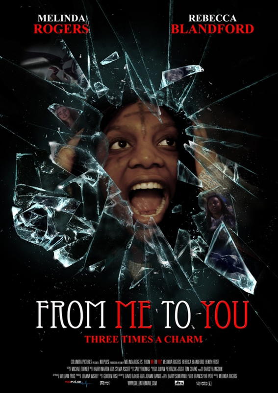
We decided to have the Zoe being surrounded by shattering glass on a black background to allow the audience to focus wholly on the character and the boldly white and red written title 'FROM ME TO YOU'. Furthermore, we decided to have the close-shot of Zoe's head, to present to the audience both internal paranoia of her own reflection on society, and also for the audience to also focus on the detains of the glass surrounding Zoe.
As a group we wanted to include traditional horror posters in terms of basic features, though we wanted to make a distinct image, with the overall result being that the poster being similar to existing posters in order to attract to the aimed audience. The reason for why i chose this poster 'Mirrors'. Is because the main attraction is half of the face of a screaming woman; and in my film Melinda (Zoe) would be the one haunting Rebecca (Jozi) after Jozi summons Zoe. Then you see half of the mouth like the mouth was separated which is what occurs in the film and the face seems to be coming out from the darkness behind her. The woman in the poster stands out as her eyes are widening in fear which indicates that she is being scourged in some way. Moreover there's a tint of red smeared across her face which has a negative connotation of blood and violence. the title is another tint of red this poster contains. The title itself lightens that the film is about mirrors as the second 'R' is reflected back from the normal 'R'. At the top of the poster is states 'From the director of' and 'The hills have eyes' which can attract fans from the famous movie 'The hills have eyes' attracts fans and encourages audiences who've never seen and or familiar to see the movie. |
|
MR
