We will be exploring magazine covers and font page designs to identify how they persuade audiences to watch their film. One well-established elements to an effective cover is the background of the cover as it gives the audience a feel of what the characters surroundings maybe; and what makes that location archetypal. The character on the magazine is the highlighted character of the movie, and most familiarized.
three famous magazine industries
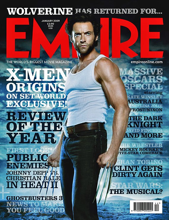
This magazine has been produced and published by 'Empire' one of the most successful and popular magazine industries. The newly released movie was 'X-MEN Origins'. (Wolverine, played by Hugh Jackman) is the famous actor on the paper, and is also the main character in the movie; he is familiarized by his striking hairstyle, white vest, dark brown belt, dark blue jeans and mainly the swords sticking out between his knuckles. The background looks like a cold, deserted land which suggests that the character is courageous, because ordinary people wouldn't be walking in a desert; this gives the audience an idea that the character isn't ordinary, but extraordinary.
The main colours on this cover is white, black, red and blue. The title of the magazine is bold and red, to show the magazine name. The subtitles are also bold, black, a little smaller, however they too stand out. The main audiences for this cover would be females and males. The reason for this is because, females would admire his features and the character he plays. The males would appeal to this magazine, because they would also admire his features and feel inspired by him.
The main colours on this cover is white, black, red and blue. The title of the magazine is bold and red, to show the magazine name. The subtitles are also bold, black, a little smaller, however they too stand out. The main audiences for this cover would be females and males. The reason for this is because, females would admire his features and the character he plays. The males would appeal to this magazine, because they would also admire his features and feel inspired by him.
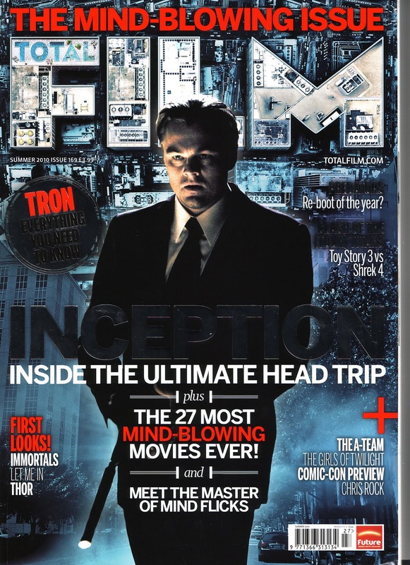
Another well-established magazine industry is FILM. The recent movie release is called 'Inception' starring Leonardo DiCaprio (plays Cobb), who is on this magazine cover. The Cobb is known for his attire of a black suite and tie and very short haircut. The body language and facial expression of Cobb in the cover, is identified as curious and determined. The lighting upon his face, tells the audience that he is the main character in the film. The background is of machinery on top of buildings, which gives another idea of what the audience would expect. The machinery on buildings also gives us an insight of the character, the character maybe intelligent and he knows how to operate mechanisms.
The intriguing statement 'The Mind Blowing Issue' is effective, as this pulls the audience's attention and make them feel engaged. The title of the magazine 'FILM' includes shapes of the top of buildings in the colour white, and is bold. The subtitles are also bold and contain two main colours which is red and white. Another captivating statement on the cover reads 'plus 27 MOST MING-BLOWING MOVIES EVER', as it shows and tells the audience the most controversial and up to date movies that are successful and a must watch.
The intriguing statement 'The Mind Blowing Issue' is effective, as this pulls the audience's attention and make them feel engaged. The title of the magazine 'FILM' includes shapes of the top of buildings in the colour white, and is bold. The subtitles are also bold and contain two main colours which is red and white. Another captivating statement on the cover reads 'plus 27 MOST MING-BLOWING MOVIES EVER', as it shows and tells the audience the most controversial and up to date movies that are successful and a must watch.
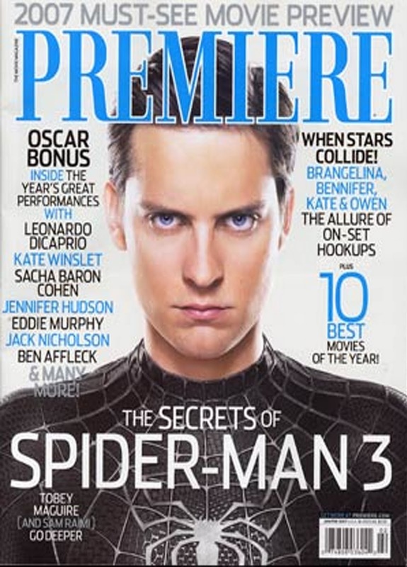
An additional successful magazine cover is 'Premiere'. Another recent release is Spider-Man 3 who Tobey Maguire stars in as Spider-Man on the cover. He is notorious for his attire which is the legendary spider suite with a spider symbol and its webs in a spiral, however in black. Another known feature of this character is his short and smart haircut. The facial expression of this character is identified as determined and brave. Which tells the audience that this superhero's personality is courageous, which is a key characteristic to make a successful superhero.
The title of the magazine cover 'Premiere' is in the colour dark blue, the colour fits nicely with the background and is much thinner than most magazine cover titles. The listing of the 'Oscar Bonus', lured the audience, however at the bottom of the list reads '& Many more!', which definitely make the audience want to purchase the paper and find more.
The title of the magazine cover 'Premiere' is in the colour dark blue, the colour fits nicely with the background and is much thinner than most magazine cover titles. The listing of the 'Oscar Bonus', lured the audience, however at the bottom of the list reads '& Many more!', which definitely make the audience want to purchase the paper and find more.
in conclusion (flash)
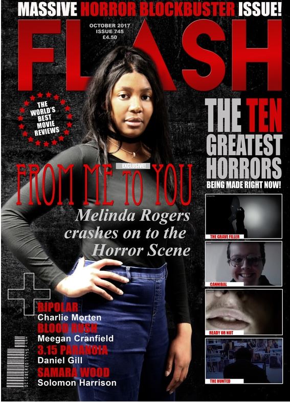
As a group we decided to go for the title FLASH as we liked the boldness, making it appealing to our audience. However we did want to stick with the colour being red, as its a cliché element to include, therefore would intrigue our viewers and engage them.
We included with traditional magazine covers by using masterheads, these are the main title of the magazine and are essential as without them, the magazine couldn't be promoted to our wider target audience. Furthermore, our magazine has a skyline which is the writing at the top as the cover above is the masterhead. This shows our traditionalism with past down magazine covers. Our magazine cover follows with common magazine covers as it includes a slogan, a phrase that briefs the magazine and shows its distinct image. Our magazine contains a bar code and straplines which allows for the sale of the magazine and provides more information about the main headline proportionately. The magazine conforms traditional magazine styles as we've a house style. The magazine has a kicker, the phrase placed above the main cover line on a magazine. Moreover, our magazine follows it has a plug- the information about the essence of the magazine. As a group we wanted to added a flash to follow with traditional magazine covers- this is the text or picture in a box, circle or other shape on the cover. To follow, we included puffs which are words and phrases on the cover of the magazine used to elevate the status of the magazine. Our magazine has a direct address, the actress on the front cover is searching directly into the lens of the camera. Then, as a group we wanted to follow with traditional magazine platforms by containing a cover price for retail sale. Overall, as a group we followed every way possible to make sure that our magazine looked traditional, therefore realistic.
We included with traditional magazine covers by using masterheads, these are the main title of the magazine and are essential as without them, the magazine couldn't be promoted to our wider target audience. Furthermore, our magazine has a skyline which is the writing at the top as the cover above is the masterhead. This shows our traditionalism with past down magazine covers. Our magazine cover follows with common magazine covers as it includes a slogan, a phrase that briefs the magazine and shows its distinct image. Our magazine contains a bar code and straplines which allows for the sale of the magazine and provides more information about the main headline proportionately. The magazine conforms traditional magazine styles as we've a house style. The magazine has a kicker, the phrase placed above the main cover line on a magazine. Moreover, our magazine follows it has a plug- the information about the essence of the magazine. As a group we wanted to added a flash to follow with traditional magazine covers- this is the text or picture in a box, circle or other shape on the cover. To follow, we included puffs which are words and phrases on the cover of the magazine used to elevate the status of the magazine. Our magazine has a direct address, the actress on the front cover is searching directly into the lens of the camera. Then, as a group we wanted to follow with traditional magazine platforms by containing a cover price for retail sale. Overall, as a group we followed every way possible to make sure that our magazine looked traditional, therefore realistic.
MR
