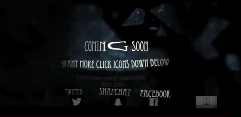
As a group we choose to have our final shot as the date the film will be released. We believed that this would be best to have at the ending of the trailer as it be remembered and would be the last thing the audience see. On this page, we wanted the motion background to have shattering glass (Rebekah contacting Zoe through mirror) and white text to stand out. Having this page at the beginning of the trailer means what was written would be abandoned as the trailer goes on.
|
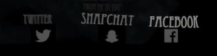
Its essential to apply all types of media in this last shot, this is for the audience to know what our social media the trailer is part of. This enables the audience members to follow social media to maintain them updates on all gossip and news about the upcoming film and the actors. Social media creates more publicity which helps makes it successful. The social media icons were manipulated to fit in with the background of the trailer on the bottom of the screen. This includes Twitter, Snapchat and Facebook.
|
|
Date
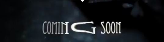
Its essential to add the date in advertisement of the film, as this reminds our audience when our film will be released to go watch it. We wanted the font to look simple, but yet the colour to stand out, therefore we used the font 'Eccentric' and a white colour. The 'G' is stretched, as we wanted this to look like a mirror effect to fit in with trailer. |
|
|
AR CHRISTY
We found this font too amateur for our trailer, as we were more intrigued in simplicity and professionalism. We also thought this looked too bulky, which takes away the simplicity. Chiller This font type again looks amateur, and we thought our audience would not see it so well, with the shattering glass background. OCR Extended This font style looks more robotic than horror, which takes away our focus on paranormal feel. We too didn't think this would fit well with the shattering glass background. | ||
In Conclusion
Its key to ensure that the background isn't too detailed as this would pull away the focus of the titles, although our background contains detailed shattering glass; that's why we used the colour white to make the titles stand out more.
Its key to ensure that the background isn't too detailed as this would pull away the focus of the titles, although our background contains detailed shattering glass; that's why we used the colour white to make the titles stand out more.
