our chosen font
In our trailer we were able to customize and use different fonts. As we were scrolling through most fonts; we knew we wanted a type of font that would look bold and set a statement, but tall to show a sinister look. This type of font that we chose is a nice mixture of classic and modern font. Popular films that inspired us was The Boy, as their font is simple but stands out by the flicker of light and on a blank white paper.
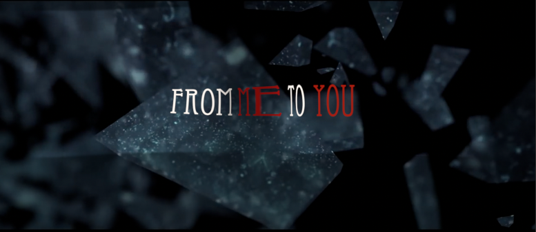
The font we chose thought stood out, and sets an environment of suspense and mystery. We've chosen the shattering glass with a black background as this relates to the trailer of a mirror being broken; however the shattering effect we thought would make the film dramatic and engaging to look at. The title of 'FROM' and 'TO' is white as it makes the title stand out from the background, but the more captivating words would be 'ME' and 'YOU'. The reason for why these words are coloured red is because the representation is death, danger and blood which relates to the film as Zoe is going to die, and Jozi is in danger as she tries and summon Zoe.
MR
